How to choose the right signage for your business
They say you never get a second chance to make a first impression and, given that your signs may be the first things that your customers see, choosing the right signage from the start can make a real and positive difference.
Before getting down to the nitty gritty of selecting colours, style, lettering and size, there are a number of considerations that you need to take into account.
First identify your target audience and decide what you want your sign to convey and what is most likely to entice them to visit. Good signage will help potential customers to find you and provide them with information about your products and services on arrival.
Hand-in-hand with this is making sure that your signage aligns with your brand – its colour scheme, font and style – and also your marketing strategy.

Location
The location of your premises is an important factor in choosing the right signage for ultimate visibility and impact. How big should your sign be, can it be viewed easily from a distance and what are the lighting conditions?
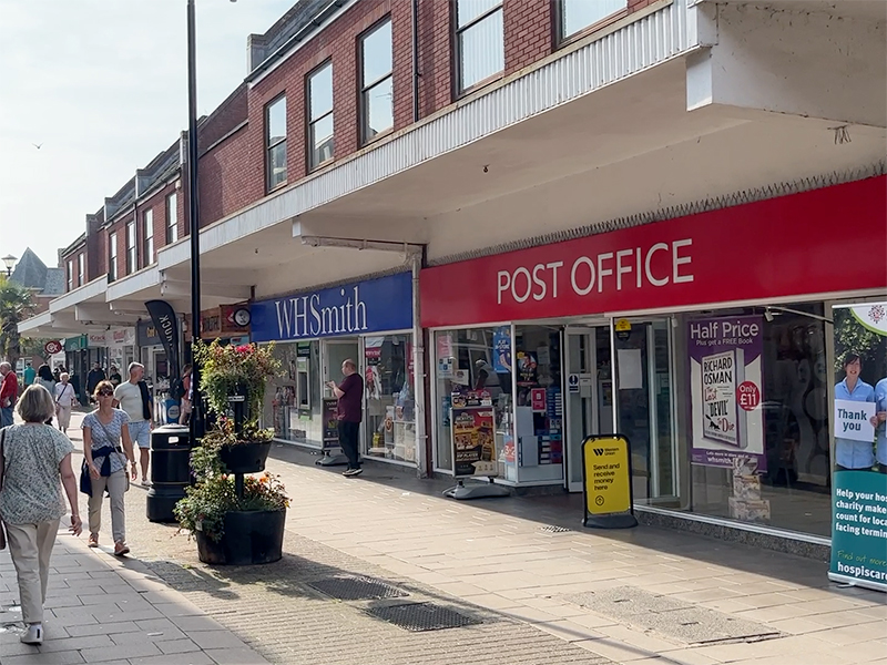
For shopping areas crowded with signs, standing out can be difficult, so having an eye-catching design will give you an advantage. Offices and public buildings, such as hospitals and schools need signs that are easily spotted from afar.
Planning permission
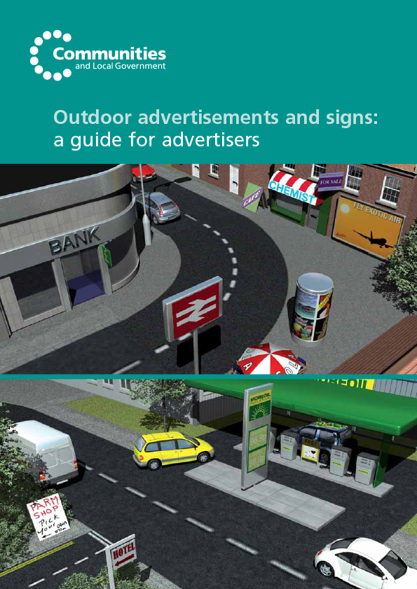
It’s worth noting that some signage may need approval from your local council. The planning regime for advertisements, including signs for businesses is complex. But basically, there are five standard conditions that must be complied with:
- Be kept clean and tidy
- Be kept in a safe condition
- Have the permission of the owner of the site on which they are displayed (this includes the Highway Authority if the sign is to be placed on a road)
- Not obscure, or hinder the interpretation of, official road, rail, waterway or aircraft signs, or otherwise make hazardous the use of these types of transport
- Be removed carefully where so required by the planning authority
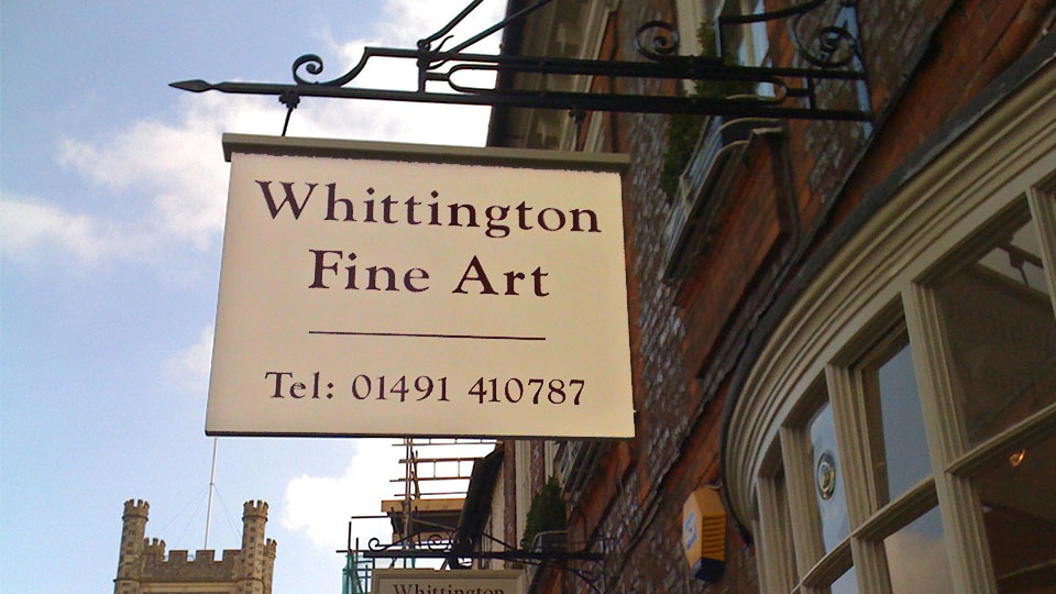

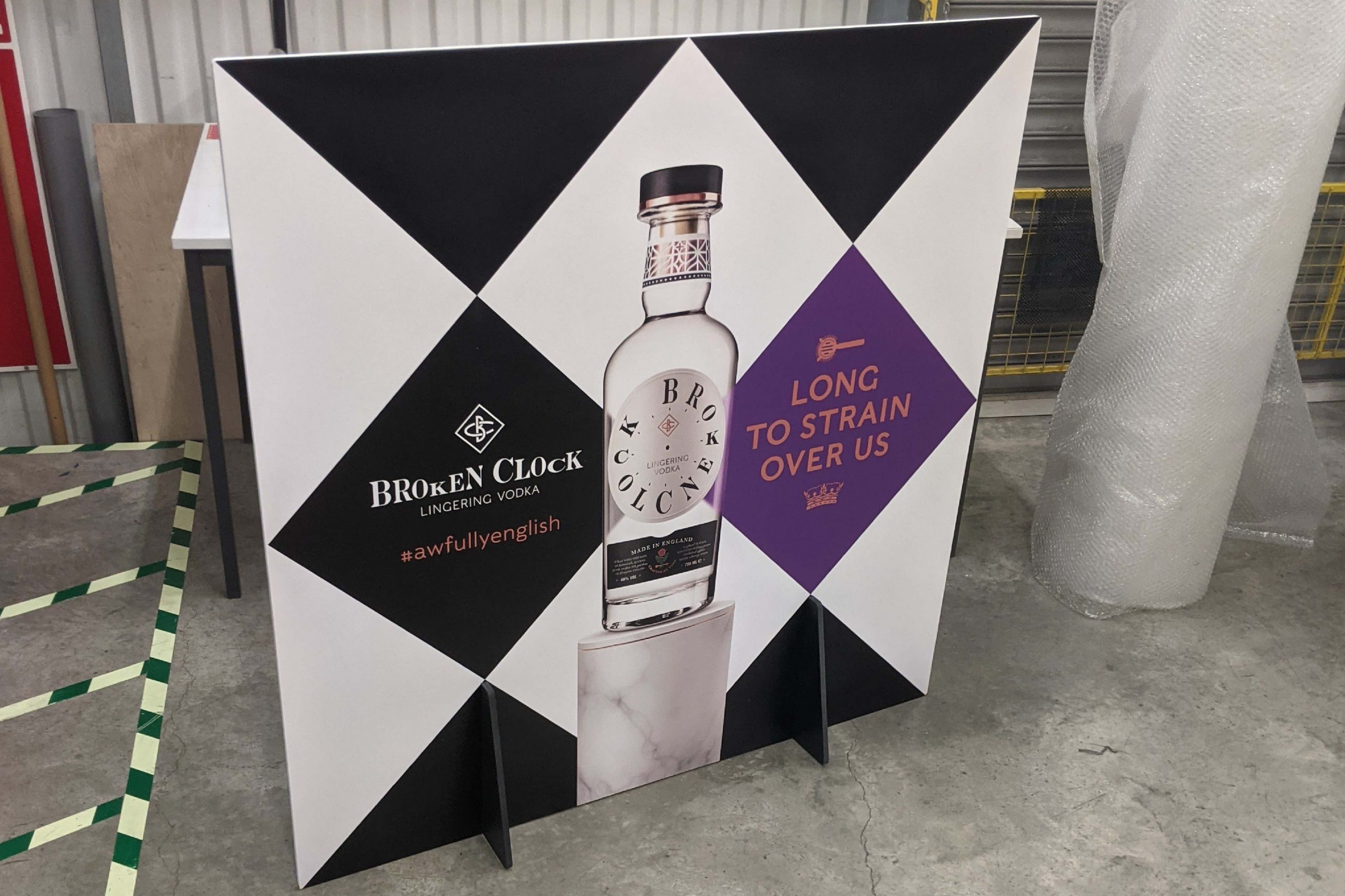
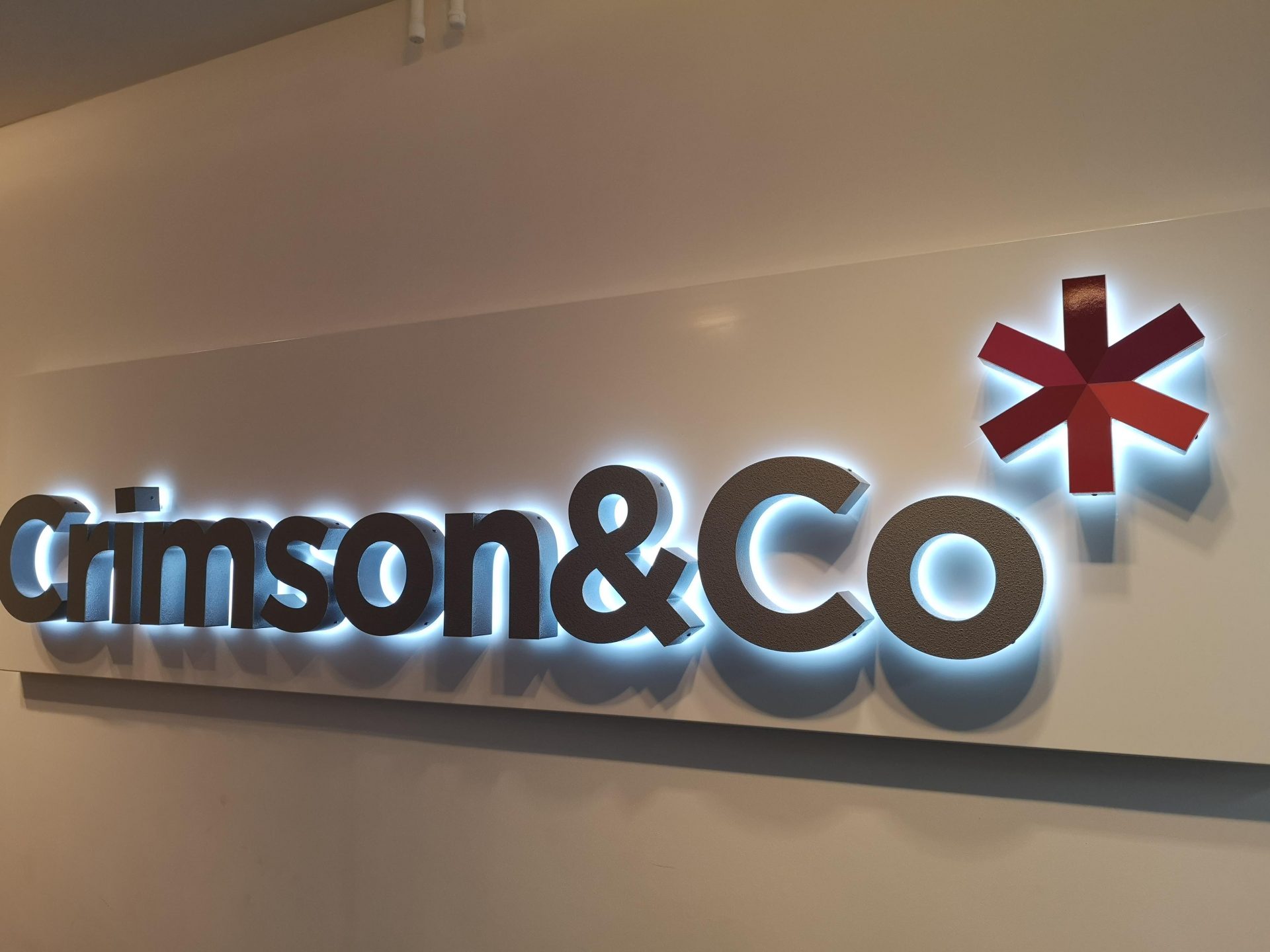
Sign types and materials
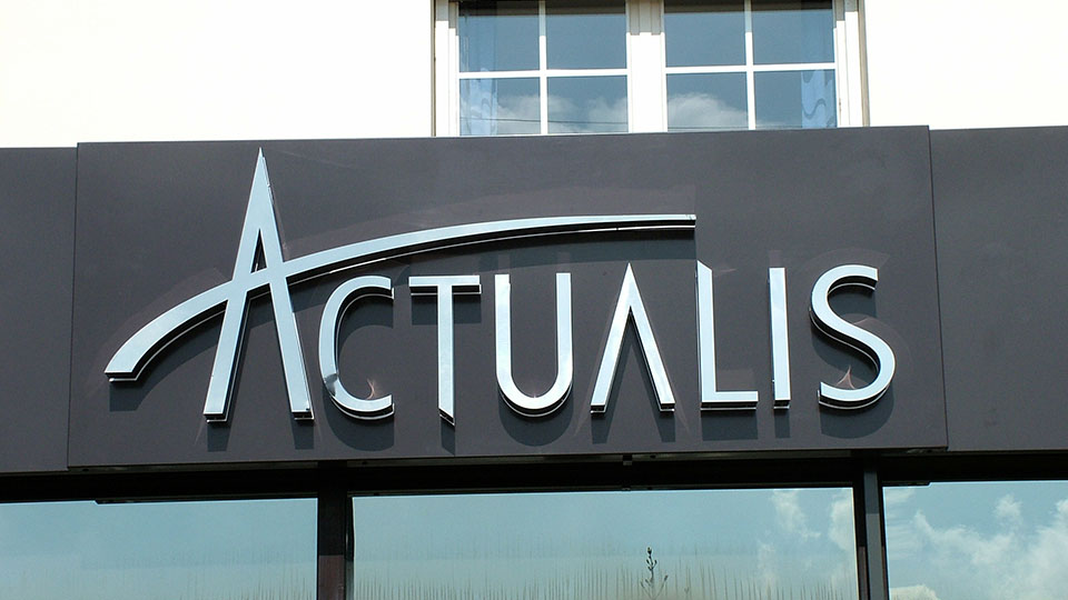
fter reviewing all the above you can then get down to selecting the signage that meets your needs and, importantly, fits within your budget. For office buildings, care homes and hotels signs formed using individual letters mounted on the facade of the building are perhaps the most suitable. These letters can be simple cut out acrylic, polished or brushed stainless steel or illuminated, subject to consent from local planning authorities.
Many types of signs are available for factories, clinics, hospitals and schools etc; however, we recommend composite folded tray signs with a latex printed face. These offer the double advantage of being both cost effective and durable.
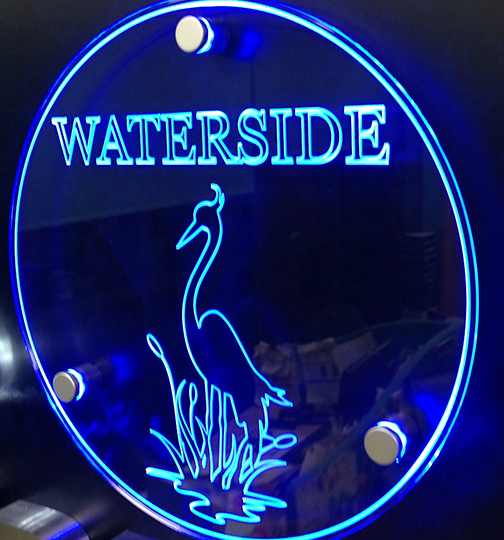
Depending on the budget available, folded composite signs are a good choice for retail, on the shop fascia. Signs that are fully or partially illuminated are suitable for high street or retail park locations, again subject to planning permission.
If you opt for a very large sign, we recommend one made with aluminium casing with LED lighting and a large flexible face, all of which can withstand strong winds.
To sum up, when choosing signage, you want a style that reflects your brand and values, that resonates with your target audience, fits within your budget and suits the location of your premises.
For advice on choosing the right sign for your business, large or small, please give us a call. We can also advise you on whether you will require local authority planning approval.


